After writing my previous blog post about calculating an average rating properly, it occurred to me that I’ve never really explained my views on rating systems and their relative merits.
Now, first, let me say that I won’t be getting into the whole objective vs. subject voting mess. (The “It’s a classic and a masterpiece, but I don’t want it showing up in my recommendations” problem.) That’s its own mess. This post is purely about using good UI design to encourage consistent input across a large population of users aside from that issue. That said, let’s get started.
These days, it seems like everyone either has or is planning to move to a simple up/down rating system. YouTube is probably the classic example. My understanding is that they moved from a star rating system to a like/dislike rating system because the former didn’t work out well with the general public. (Some people almost never give out high ratings, some people almost never give out low ones, some people found it too much effort to decide, and the result is a mess, mathematically.)
The fundamental problem with cutting things down to such a two-value system is that it fundamentally doesn’t give you much data to work with and it’s my hypothesis that it also encourages noisy, polarized data above and beyond the obvious, since people don’t typically take the time to rationally analyze their impression of middling content. (In essence, it’s throwing the baby out with the bath water.)
So, if we can’t reduce the number of choices users have by that much, how can we tweak the presentation so that users respond more consistently?
First, let’s look at where star ratings actually come from. According to Wikipedia’s Star (classification) page, the first instance of repeated symbols for ratings was in an 1820 guidebook by Mariana Stark, which used repeated exclamation points. Following that, Murray’s Handbooks for Travellers and the Baedeker Guides replaced the exclamation points with stars.
There’s something very important to notice here. Star ratings originated in the context of highlights! They wouldn’t give some semi-permanent pile of horse manure in a random London back alley a zero-star rating… they’d just omit it!
So, our first step should be to acknowledge that mismatch and bring ourselves into line with human psychology. When we have a low opinion of something, we don’t stop at zero. We use colourful words such as “hate”, “loathe”, “despise”, and “detest”, which express negative emotional value …so, let’s make zero the middle of our scale.
Notice something familiar about that change? We’ve reached upvote/downvote. It’s just a very primitive form of what we’re seeking. People may not agree on how much room to leave on each end of a scale for especially good or bad content, but everyone understands the meaning of a transition point between “like” and “dislike”.
So, what’s next? Well, how about ambivalence. In an upvote/downvote system, users are forced to take sides. There’s no way to express “I don’t really care”, “I have no opinion”, or “Its only noteworthy characteristic is how un-noteworthy it is.” …so we at least want three choices:

Thumbs up from Font Awesome by Dave Gandy.
Modified under a CC-BY-SA 3.0 Unported license.
I’m not a graphic designer, but you get the idea. With the addition of a middle choice, it already represents real human opinions much more effectively.
This is actually the bare minimum I consider for a viable system and, when forced to deal with like/dislike systems I resort to using “abstained from voting” as a means of expressing a third value… and that in itself is a clue.
I coloured the middle values yellow to make them distinct from “unset”, but is that really necessary? What’s the difference between “I viewed it and didn’t vote” and “I viewed it and selected the neutral option”? I’d argue that drawing such a distinction is counter-productive hair-splitting, so I’ll use grey for the neutral option going forward.
So, what’s next? Well, how about degree? Humans aren’t stupid, so I’m not willing to give up on a 5-step rating system yet. If we’ve got a clear and obvious meaning for the middle point, it’s not hard for people to consistently answer the question “Did you like/dislike it a little or a lot?”, so let’s put two choices for like and two for dislike.

Thumbs up from Font Awesome by Dave Gandy.
Modified under a CC-BY-SA 3.0 Unported license.
Using color/brightness on hover and/or selection to “light up” the icons spanning from the selected one to the center can reinforce the understanding that this is a “distance from the center” metric, but having everything grey exacerbates a problem that was growing with the face-based approach.
While a soft smile or frown can serve as a general “like” or “dislike” icon, one can dislike something for many reasons. Emotions like anger, disgust, and extreme sadness all have their own distinct facial expressions. It’s easy to mistake the face-based visualization as a request for a qualitative evaluation of one’s emotional state (anger vs. sadness) rather than a quantitative one.
Furthermore, faces are complex shapes which can be difficult to pick details out of at small sizes. What we need is a set of symbols which are generic, international, and scale well.
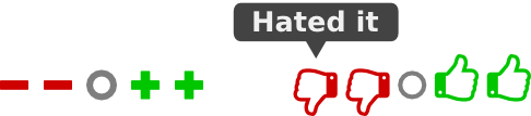
Historically, I wouldn’t recommend thumbs, since the meanings of gestures vary so widely around the world, but the thumbs up and down icons seem to have taken on enough of an international meaning online to keep them in the running.
…so what’s the alternative choice? Well, how about plus and minus symbols? Math is international and everyone can understand their meanings in context.

Thumbs up from Font Awesome by Dave Gandy.
Modified under a CC-BY-SA 3.0 Unported license.
Doesn’t that look a lot easier to translate opinions into than a simple row of five stars? …and if not, tooltips can give that little extra boost.
Thumbs up from Font Awesome by Dave Gandy.
Modified under a CC-BY-SA 3.0 Unported license.
(And there also seems to be support for this model from the experts whose salaries depend on doing this sort of thing. Every professionally administered survey I’ve ever taken has incorporated questions with the choices “Strongly Disagree”, “Disagree”, “Neither Agree Nor Disagree”, “Agree”, and “Strongly Agree”.)
In summary, don’t be too quick to sacrifice data and throw out a UI that isn’t working. Sometimes, all it needs is a little tweak.
Bonus Tip: Extra Precision
Let’s suppose that you’re trying to upgrade a system that uses out-of-10 rating or you need to serve a more experienced user base like me (who sometimes feel the need to rate something as being “great” rather than “good” or “excellent”). There is also a way to support this without falling back to the “5 stars to the right of zero” problems that started this whole mess.
The secret ingredient is decimals. Users will have a much easier time if you draw a distinction between normal (integer) and exceptional (decimal) rating precision. In fact, “Rate in the range from -2 to +2… use decimals if you need to” is not only easier than “Rate in the range from 1 to 10”, it’s also more powerful since, if necessary, it can be extended to however much or little decimal precision you need.
In my experience though, it’s so rare for me to desire precision beyond “-2 to +2 in steps of 0.5” than I wouldn’t be concerned with it.
So, how do we produce a UI for this? Well, think about the psychological use of decimals. They’re extra precision that’s not normally needed, so they should be out of the main workflow where users don’t have to fret over them.
There are various ways to accomplish this , but the simplest way to visualize them would be a design inspired by the keys on a piano. Play all the white keys, and you can make perfectly good music in the key of C major… but the black keys are there when you want to do something more advanced.

Thumbs up from Font Awesome by Dave Gandy.
Modified under a CC-BY-SA 3.0 Unported license.
…keeping in mind, of course, that, for mobile use, it’d probably be best to hide the half-step buttons and present some kind of alternative method for entering high-precision information, such as a hamburger button with a popup.
(As zero-centered designs lend themselves best to odd numbers of choices, you’ll have to decide whether the tenth choice should be omitted or added onto either end on a case-by-case basis.)
 Designing a Better Rating Widget by Stephan Sokolow is licensed under a Creative Commons Attribution-ShareAlike 4.0 International License.


Like the thought process here – but I’ll say that if I’m unmotivated by the content, I’m likely also unmotivated to react (and that makes the zero rating unnecessary and is at risk of measuring something orthogonal to the quality of the content – it’s measuring the vocalness of the user).
True.
I was thinking about that particular aspect more in the context of a Netflix-style recommendation system, where the motivation to be vocal is that it contributes to the accuracy of your recommendations.
Given that, users need to be able to distinguish between “Never seen it” and “Saw it before I opened an account here. Rating: 0” without having to re-watch what could be a feature-length film (or run afoul of complex “amount viewed” heuristics) in order to to flag it as viewed.
I also made that judgment based on sites where, for lack of a middle option, I actively leave my rating unset because, otherwise, the site would force me to give a wildly unrepresentative rating.